Are you looking for the best website builder for designers and creatives?
To help you find the right solution for you, we took some of the best website builder tools for test drives and looked into their designer-friendly features.
There are many website builders out there that even beginners can use, but creative professionals need more advanced customization tools. Lucky for you, just because they’re easy to use doesn’t mean that they’re lacking in functionality.
Let’s dive in.
What is the Best Website Builder?
Choosing the best website builder can be difficult, as there are so many to choose from.
When choosing the right builder to make a website consider price, reliability, web hosting services, technical support, site speed, SEO, features, ease of use, template design, and more.
When you’re a designer it can be difficult to find a website builder that understands your needs.
If you’re looking for a tool that will help you build a beautiful website from scratch, you need to look for one that is specifically tailored for designers and that gives you all the options you need to create your vision.
What to look for in the best website builder for designers?
You don’t have to build your client sites from scratch. In fact, a lot of designers and developers don’t. Sophisticated customization options are a must, no doubt. Your website builder shouldn’t restrict your design capabilities, so being able to modify each element should be on top of your requirements.
Look for this when trying out a new website builder:
Drag-and-drop builder: Being able to easily move various elements around the content area will improve your workflow.
Visual effects: Impress clients and visitors with effects such as parallax scrolling or animations to elevate your work.
A choice of pre-made templates: You’ll be able to work much faster if you have high-quality templates to use as a starting point.
Integrations: Streamlined integration with third-party apps and/or platforms such as Google Analytics will enhance your final products.
Slides
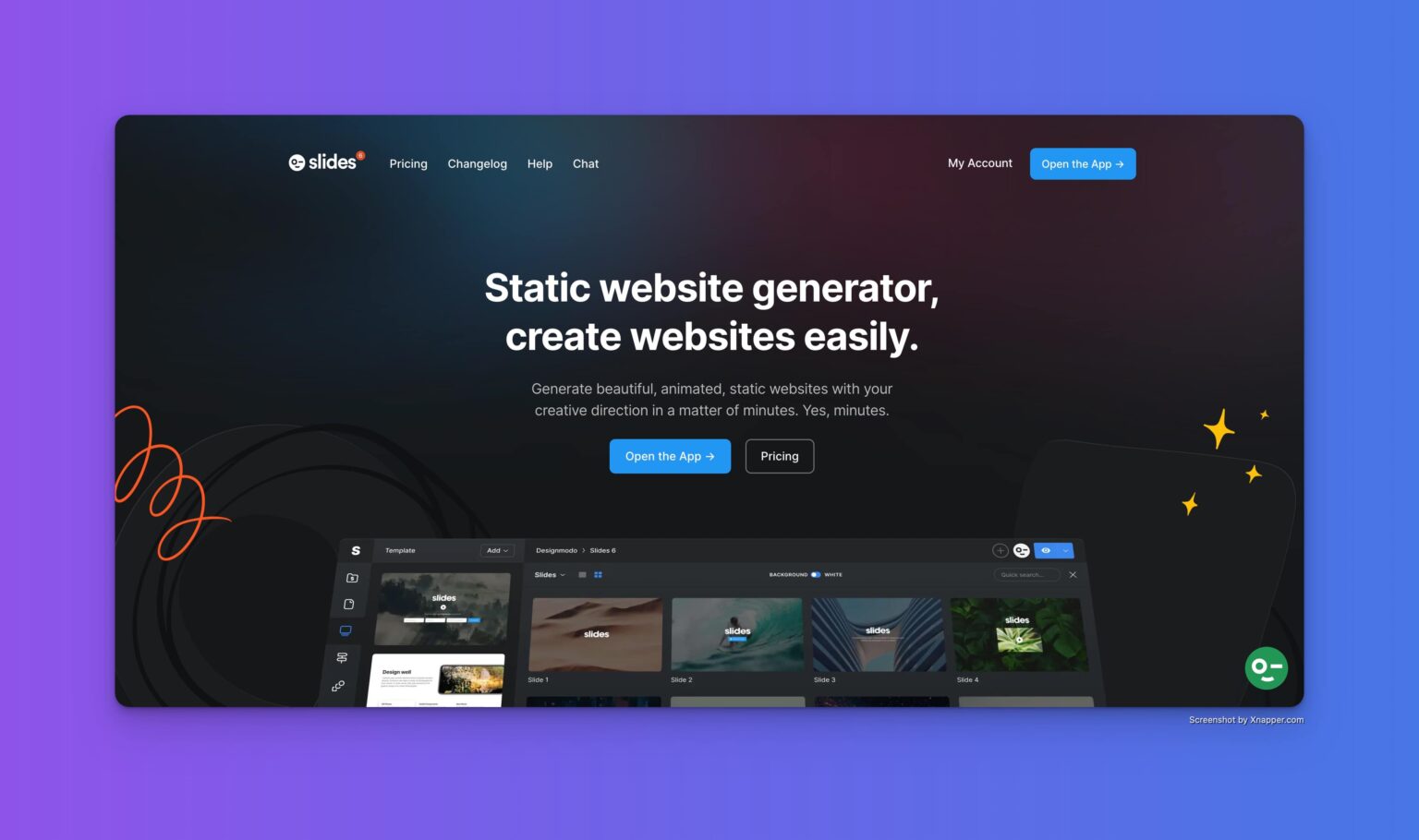
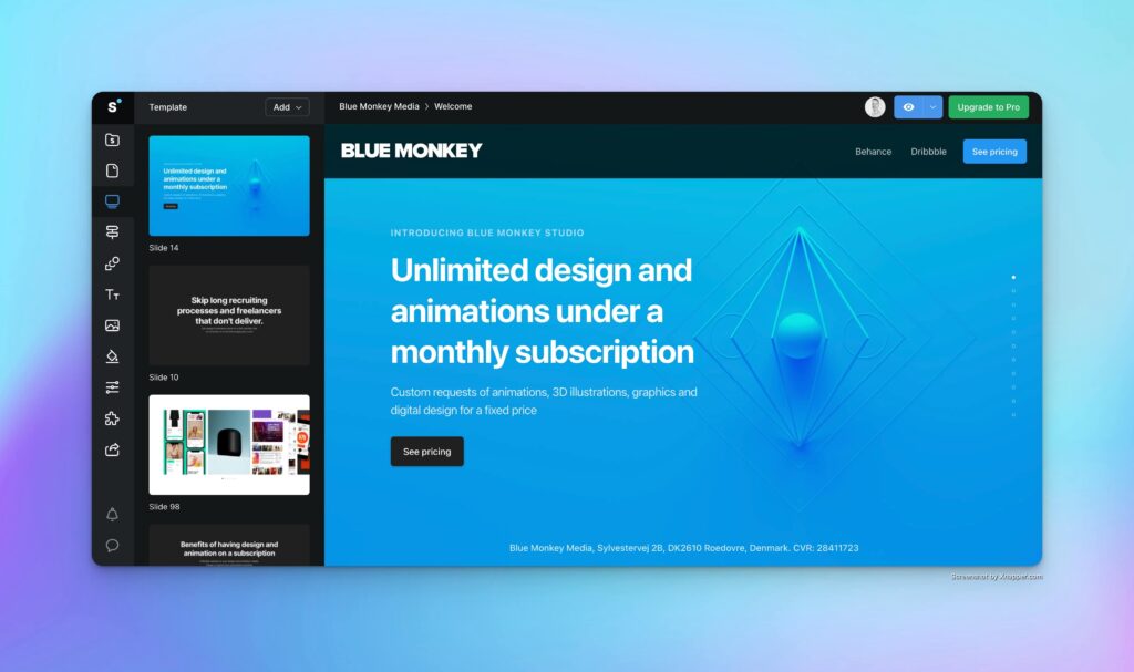
Slides by Designmodo is one of the easiest ways to get an awesome looking landingpage created quickly.
It’s a static website generator, meaning that you don’t have to install a CMS like WordPress or build a backend in Webflow to get it live on the web. You just download a zip-file from Designmodo’s Slide builder containing all the assets for your site and upload that to your web hosting. You don’t have to deal with backend databases or anything. Just upload your files and it’s live. The downside is that if you want to make any changes to your website you have to edit the html files or images and re-upload the files to your server in order for the changes to take place on your site.
Slides features over 140 slides in both light and dark variations with animations and page transitions that makes it possible to build a website in a few minutes.
I’ve been using it for many years for my own projects and it creates high quality and fast-loading static websites quickly.
User Experience
The setup is quick and easy. You can create projects and websites directly from your dashboard. The builder includes 140+ slides with different layouts, so it’s easy to find slides that fit your needs. Once you have assembled your website it’s easy to customize the colors, transitions, and overall look of your website before downloading it.
Pricing
The setup is quick and easy. You can create projects and websites directly from your dashboard. The builder includes 140+ slides with different layouts, so it’s easy to find slides that fit your needs. Once you have assembled your website it’s easy to customize the colors, transitions and the overall look of your website before downloading it.
What I like / Dislike about Slides
Given the many layouts and customisation options it’s quick to assemble a proof of concept website for a project, but if you don’t know anything about coding or HTML/CSS/JS I would stay clear of Slides and choose one of the other website builders in this list.
If you want to edit the prebuilt slides you have to edit the code yourself. Designmodo has provided good documentation with code snippets and examples as well as a FAQ for the most common problems. Until you are familiar with the framework it can take a long time to customize your website.
Given the lack of a CMS backend updating your website can also be a tedious process where you have to manually edit the code and replace the files on your server again afterwards.
Slides is best used for landingpages or brochure website with only a handful of subpages.
Slides has just been updated to Version 6 and a lot of the customisations can be set directly in the builder before export, so you don’t have to adjust the code afterwards in your code editor which is a big plus. Previously this had to be done manually and it took a lot of time.
What I like about Slides is that the overall design of the different slides is stylish and elegant and once you know how the code work you can build a landingpage in a few hours. Given that the pages are plain html, css and javacript and not tied to a CMS, the pages loads in an instant and looks great. You can play with animations and transitions directly in the builder and their example page features solutions to special layouts and integrations like fullscreen video, YouTube embed and more.
Frederik Roessell
Creative designer with 20 years of design experience working in startups and agencies in Copenhagen. Currently pushing pixels as a Senior Product Designer at a large ecommerce brand.

