I rarely get excited by “free stock photo”sites. Most of the images on these sites usually look staged, plain or boring. The best ones is still Unsplash, but most people are using the same images as everyone else, so you can easily spot an Unsplash image at this point.
I was scrolling X (twitter) the other day and came across a post from Alex Aperios about a new site, he built, called Snapshift.
https://x.com/AlexAperios/status/1760660848773656987?s=20
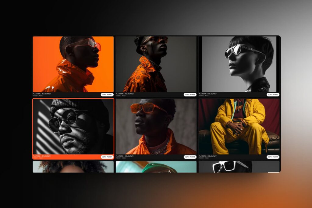
The site is very simple. It’s basically just a gallery of images. The difference is that the images are created using Midjourney and you can copy the prompt so you can recreate the image in Midjourney yourself.

I tried it on a few images and the results are pretty good.
If you’re looking for an alternative to Unsplash for your design projects, go check out Snapshift:
https://snapshift.framer.website/
Frederik Roessell
Creative designer with 20 years of design experience working in startups and agencies in Copenhagen. Currently pushing pixels as a Senior Product Designer at a large ecommerce brand.


